Brand Evolution with website redesign to strengthen authority and credibility of Total Engineering Solutions firm.
Loughton-based Total Engineering Solutions firm CLC Facilities, approached Swan when looking to elevate their brand in line with their business growth. As an established company they felt their brand no longer represented the quality of their work or the success of the business so they were looking for a modernised brand identity.
Transforming a brand’s identity is not merely about visual changes; it demands a comprehensive and strategic approach aligned with the company’s objectives, values, target audience, and industry position. To elevate CLC Facilities’ brand, we began by revisiting the fundamental aspects of their business. To facilitate this, we held a brand workshop with the senior team, diving into CLC Facilities’ business goals, market differentiation, and future aspirations.
The insights gained from this workshop formed the bedrock of our new brand strategy, which was then transformed into practical brand guidelines that could be distributed across the company. These guidelines articulated CLC Facilities’ brand mission, vision, values, and persona.
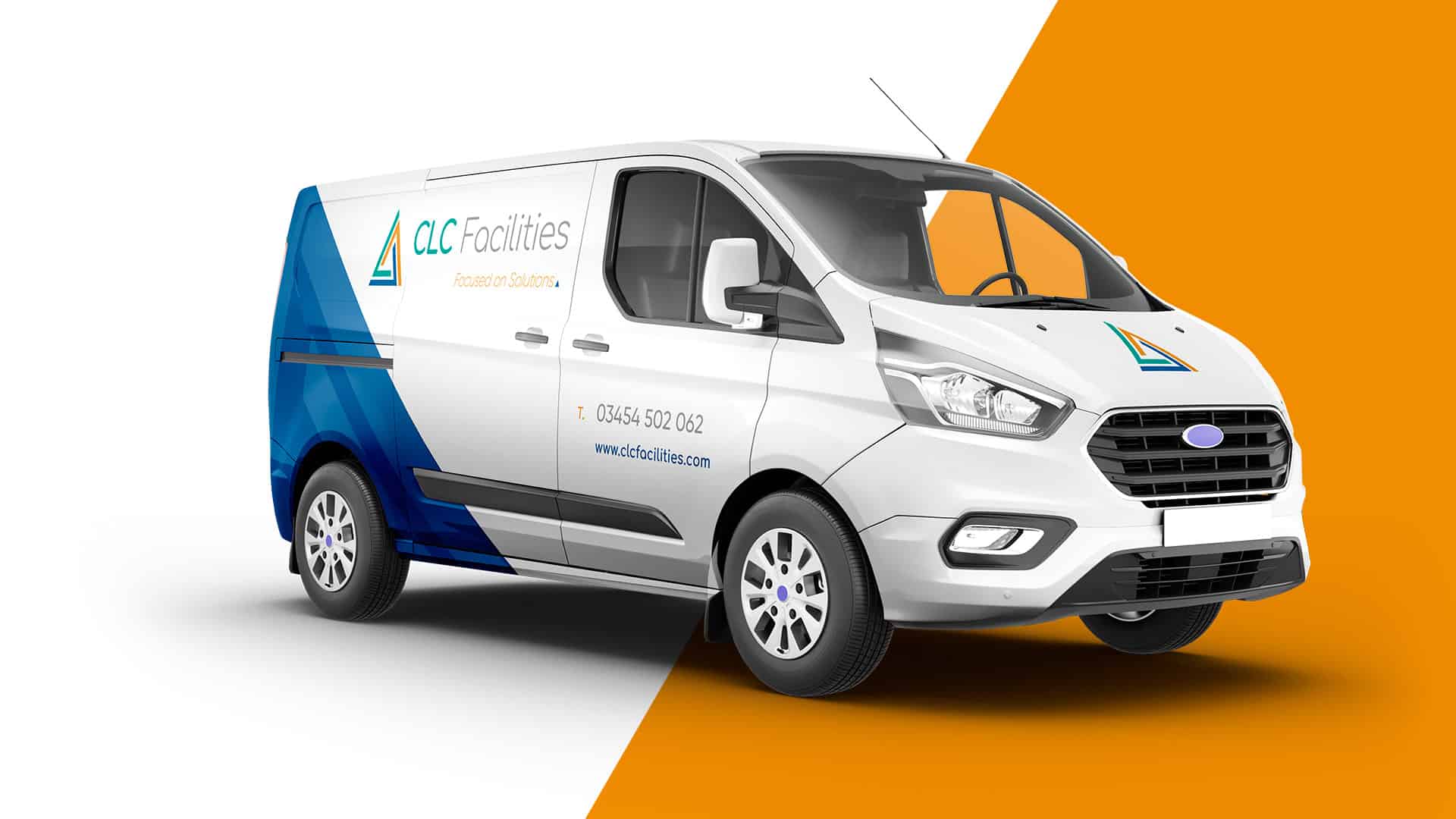
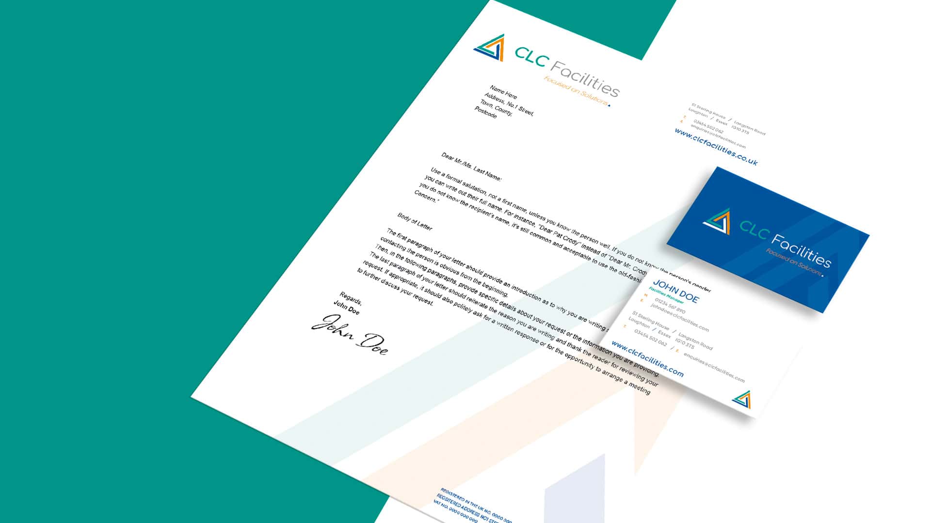
With the strategy firmly in place, we turned our attention to evolving the brand’s visual elements. Drawing inspiration from the trio of core services offered by CLC Facilities, we devised an abstract triangular icon. Each side of the triangle symbolises a distinct service, with colours that resonate within the facilities and hard engineering industry: blue for electrical engineering, orange for mechanical engineering, and green for fabric services. This emblematic icon was complemented with a rounded sans-serif typeface in various weights, culminating in a cohesive, authoritative, and representative brand identity. The client was thrilled with the concept and felt it truly represented their brand.
We applied the new branding across various customer touchpoints, including business cards, email signatures, and vehicle livery. To ensure the brand’s longevity, we devised a set of design guidelines, detailing how the logo and colour palette should be used in both online and offline scenarios.
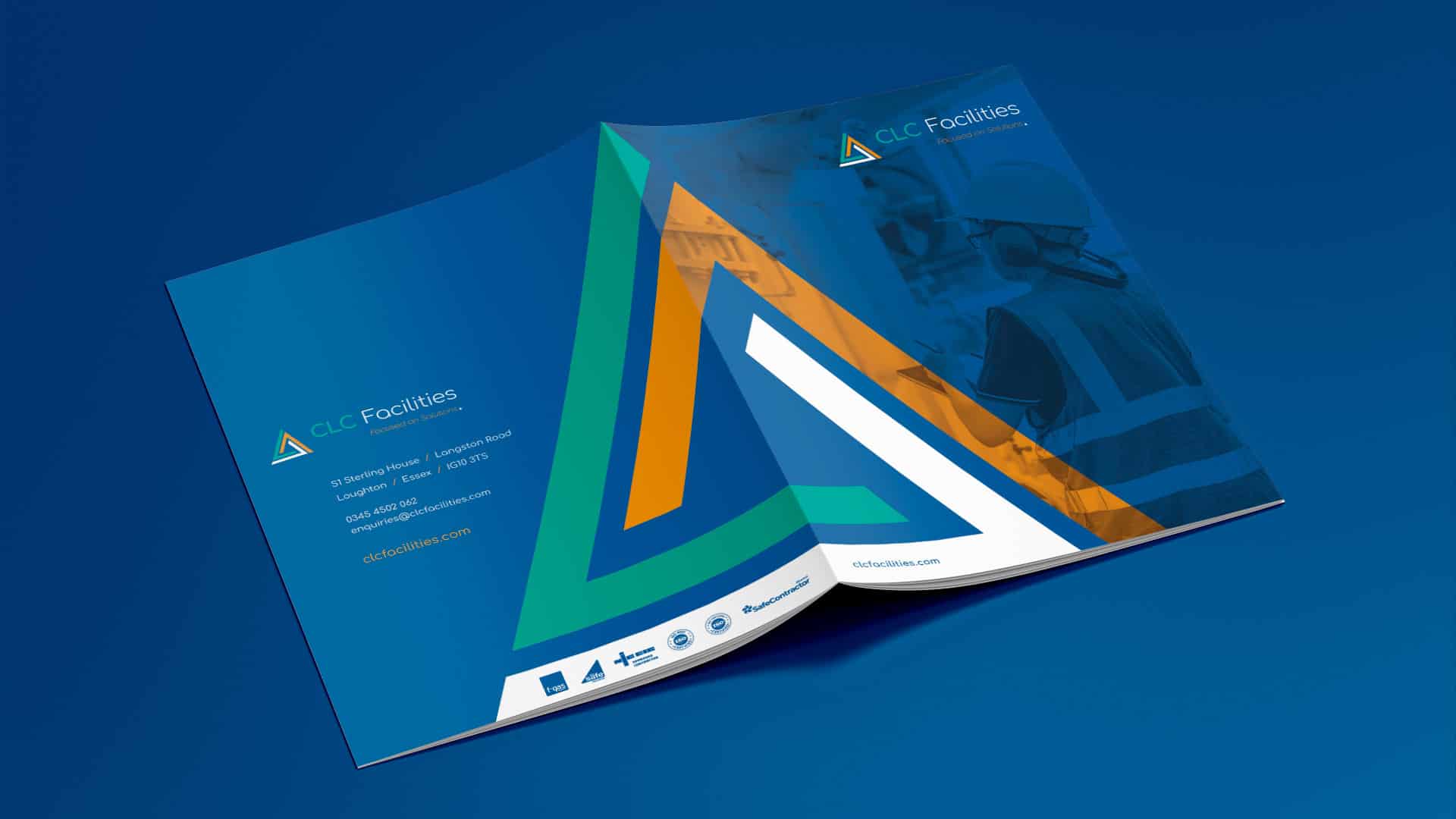
To reflect the brand refresh across all customer touchpoints, CLC Facilities wanted to produce a digital brochure to outline their services and sectors. The initial phase involved structured content planning and ensuring a logical flow of information. A clear creative concept was then established, keeping CLC’s brand and audience in mind. We crafted concise copy to detail CLC’s offerings and paired it with appropriately selected and edited images.
The final product was an interactive PDF, offering readers a straightforward understanding of CLC Facilities’ services and sectors.
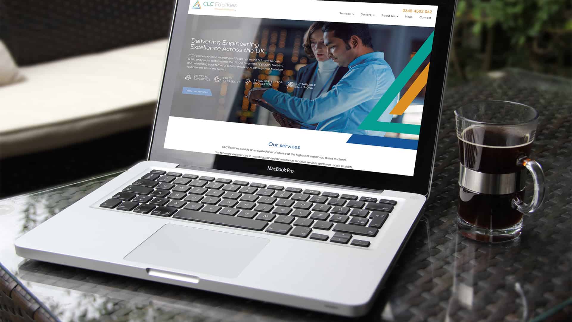
We developed a fully responsive website for CLC Facilities to effectively showcase their new brand identity, their array of services and the sectors they serve. After researching the best UX design for their target audience, the website was designed as a ‘brochure-style’ website, offering visitors a direct insight into what CLC Facilities provides.
The site includes case studies that underscore their achievements and areas of expertise as well as genuine testimonials from satisfied clients, reflecting the authentic value that CLC delivers. A dedicated section also displays their industry accreditations, reinforcing their professional stature. Overall, the website presents a thorough overview, amplifying CLC Facilities’ market visibility and credibility.
CLC Facilities held a launch party for the unveiling of their new brand and website which was received positively by clients and internal members of staff, who felt the new look represented the company and its values well. In the following weeks, the new brand has been rolled out across the entire company, so keep your eyes out when your on the roads in Essex and you might spot one of their newly branded vehicles!

Fill in the form below and one of our team will get in touch to discuss how we can help you, on your journey to success.
