James and Alex approached Swan Creative when looking to bring their new passive fire protection business to life. With a background in construction, they noticed a gap in the market when it came to Fire prevention services.
They wanted to utilise their industry knowledge and experience market create an independent brand, that stood alone from their main business.
To kick off the project, we held a brand workshop at our design studio in Leigh-on-Sea. Our team worked closely with the duo to develop and define their target audience and brand identity.
Unlike the emergency sector, the pre-emergency market focuses on prevention rather than immediate preservation, meaning that the brand’s visual identity, needed to showcase strength, reliability and trust.
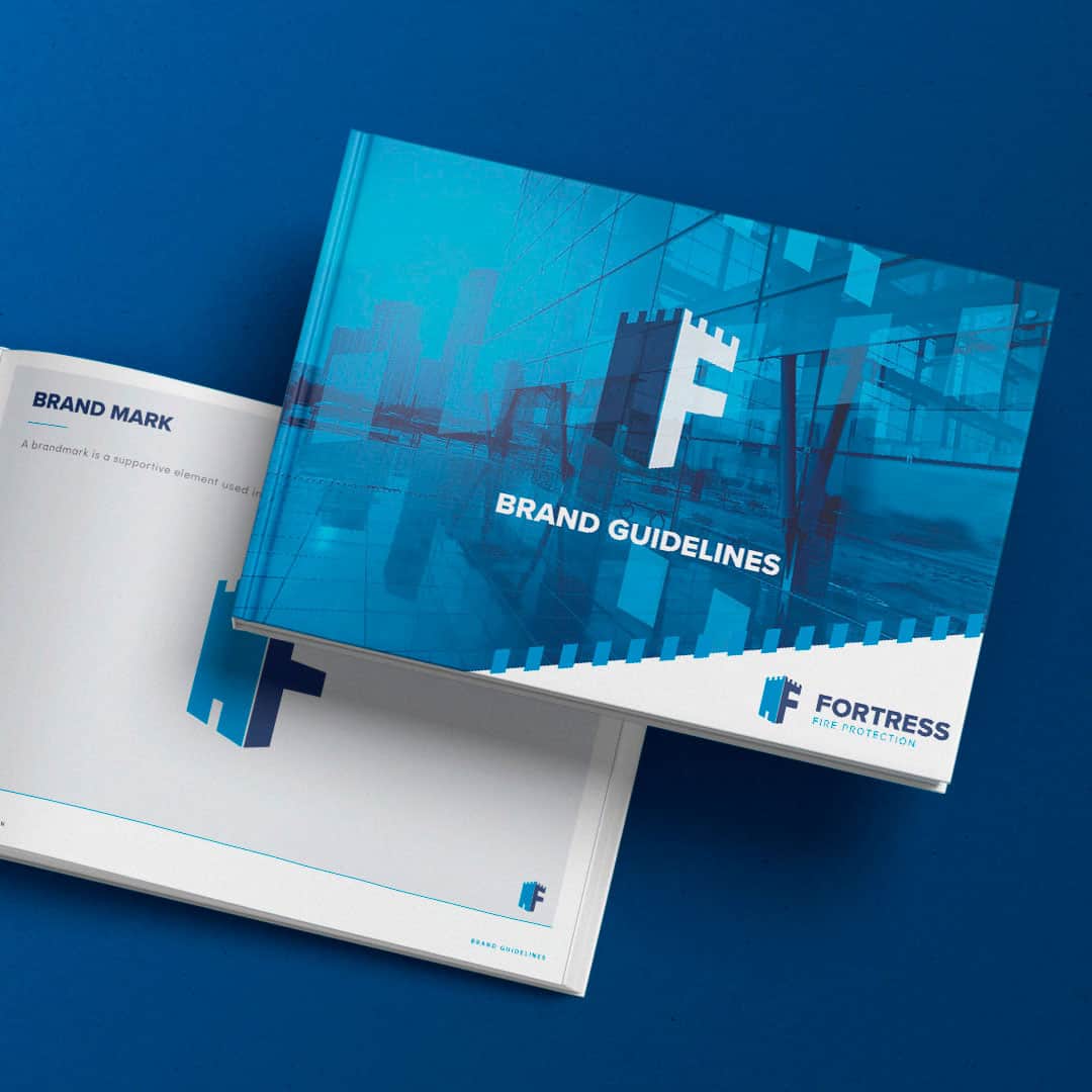
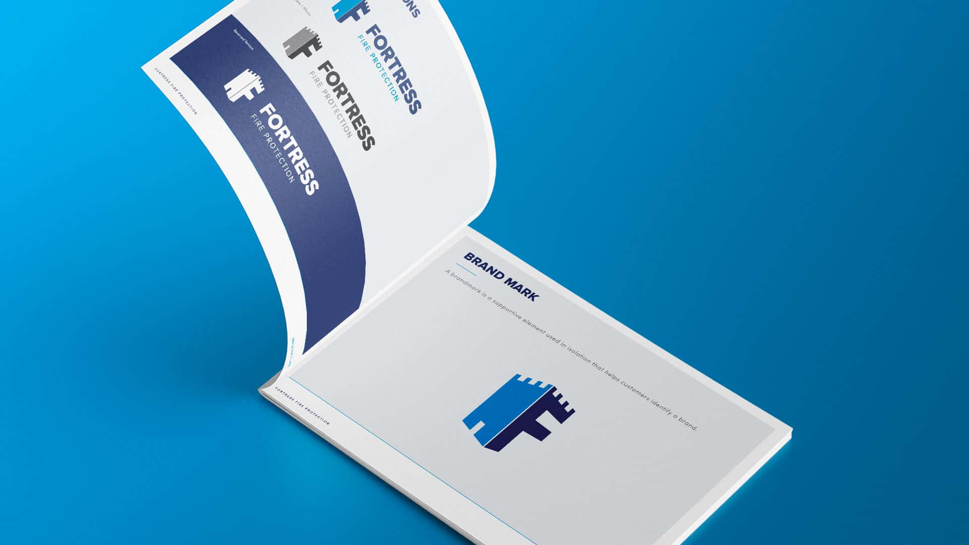
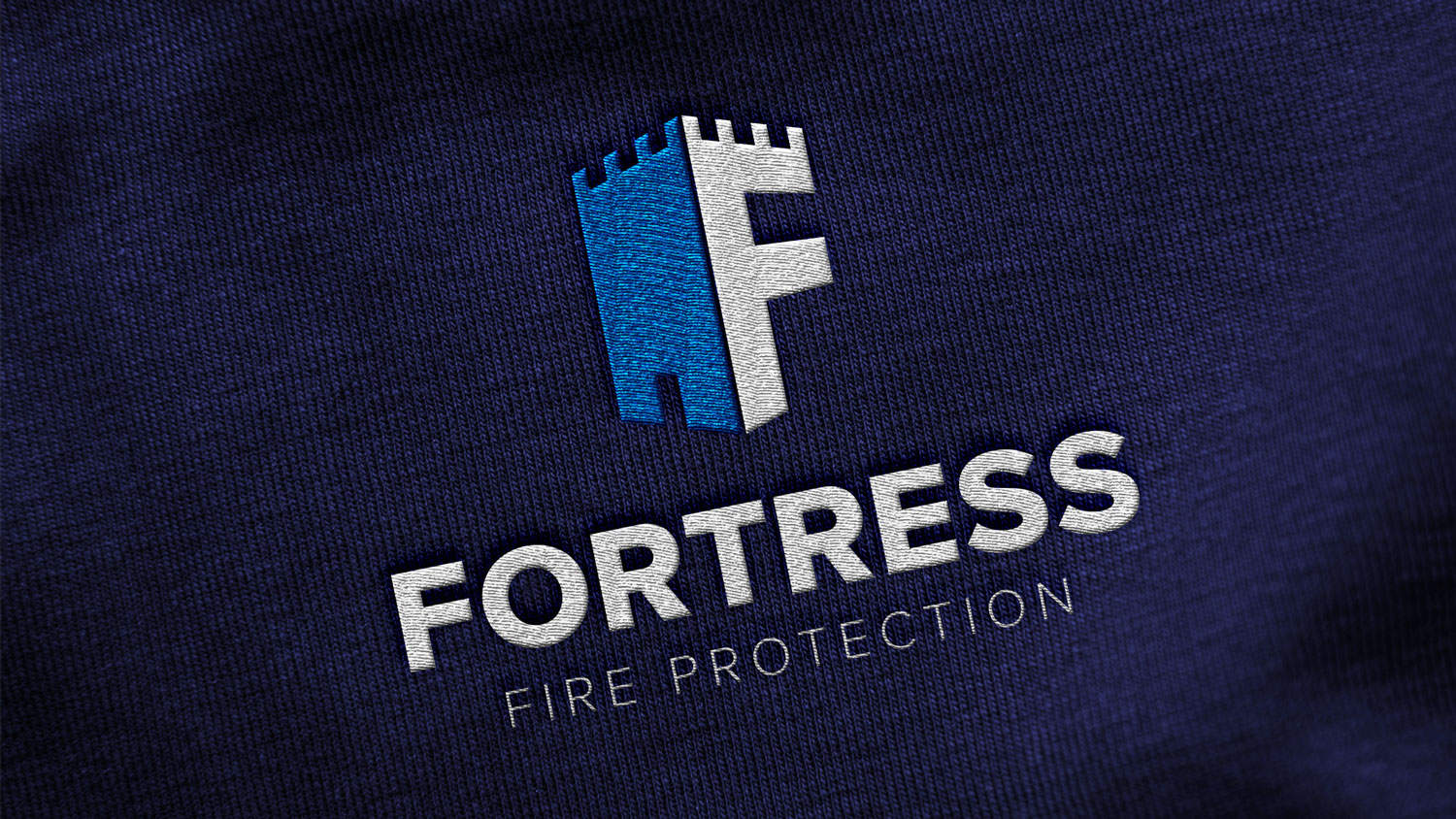
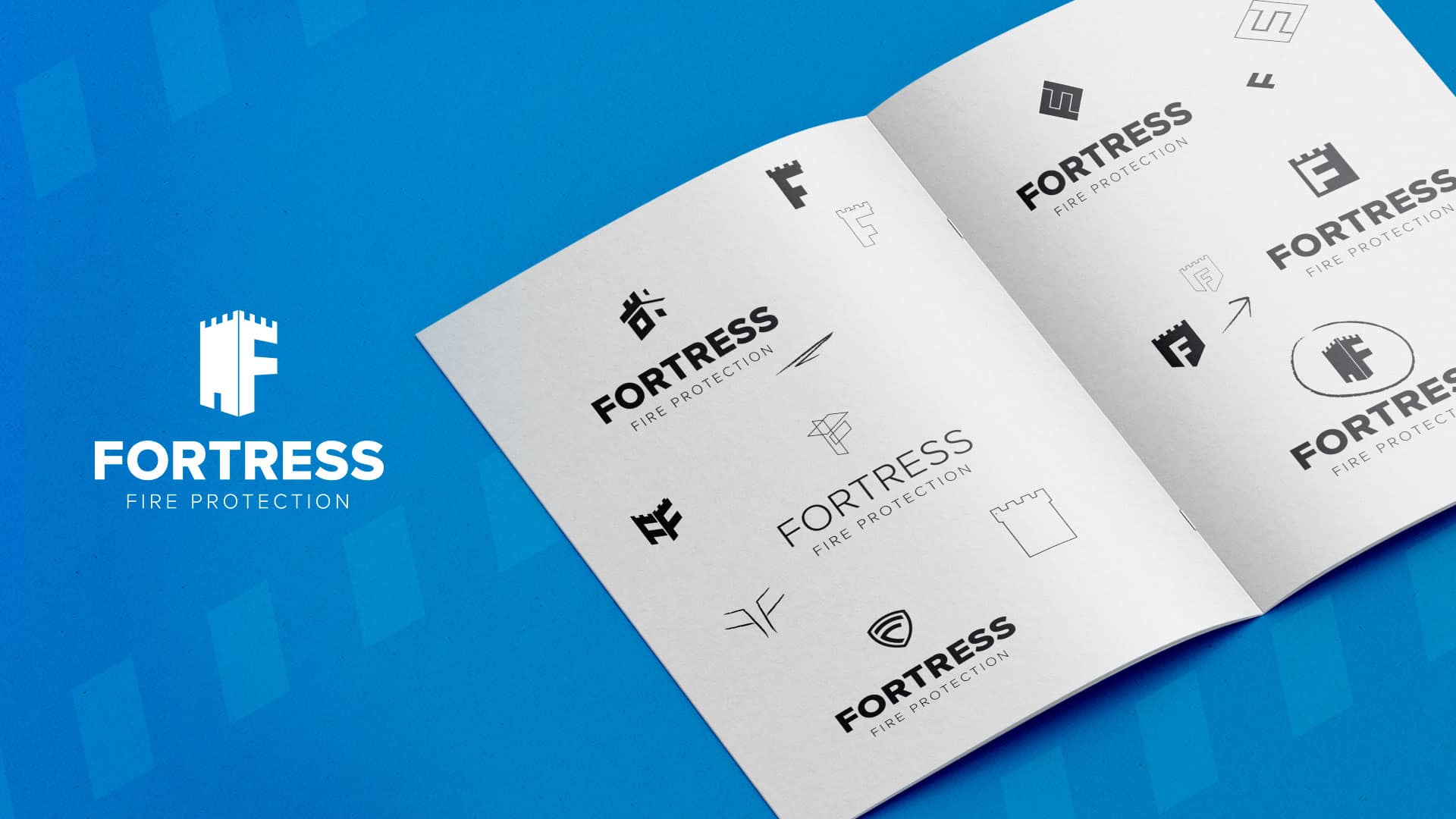
To reinforce the idea of protection our designers started developing concepts that incorporated a fortress. Merging this with the Fortress Fire initials formed an instantly recognisable and powerful brand mark, that can either be used as part of the full logo suit or as a stand-alone icon. The strong, clean and timeless typeface used reflects the confidence in the products and services provided.
To enhance the branding one step further, we created a brand extension that used an abstract door aperture to create a chevron mark. This brand extension can be used consistently across wider campaigns to increase brand awareness and recognisability.
When defining the colour palette, the team wanted to again showcase the feeling of confidence, safety and trust. As blue is the most reliable colour according to colour psychology, the team opted to use a dark and light blue as the brand’s primary and secondary colours.
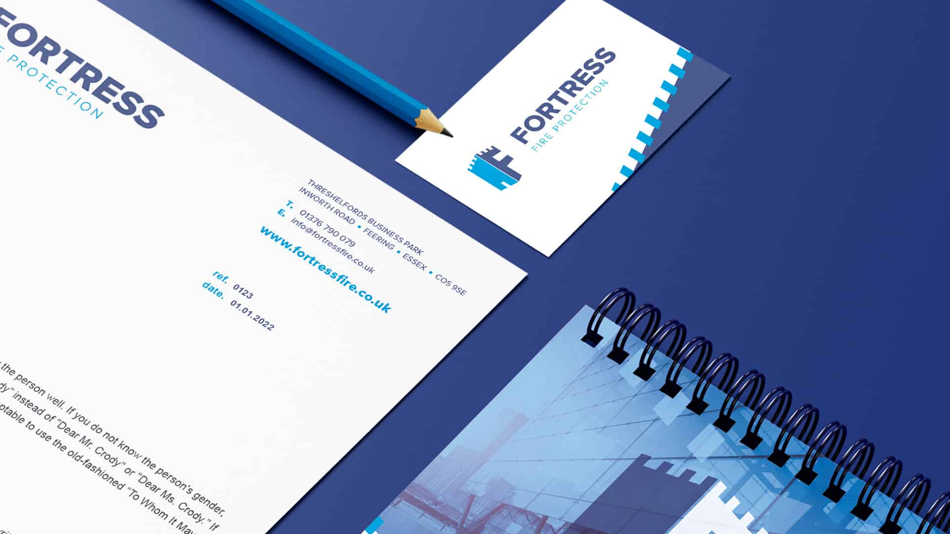
Once the initial branding was complete, we focused on creating the brand guidelines. These guidelines defined the tone of voice and outlined the company’s core values, ensuring all communications both internal and external aligned. The new branding was then flooded out into wider marketing collateral including, brochures, email signatures and social media graphics.
A stunning brand that has established its position firmly within a new market, reinforcing a sense of security and trust within their intended target audience demographics.
Fill in the form below and one of our team will get in touch to discuss how we can help you, on your journey to success.
