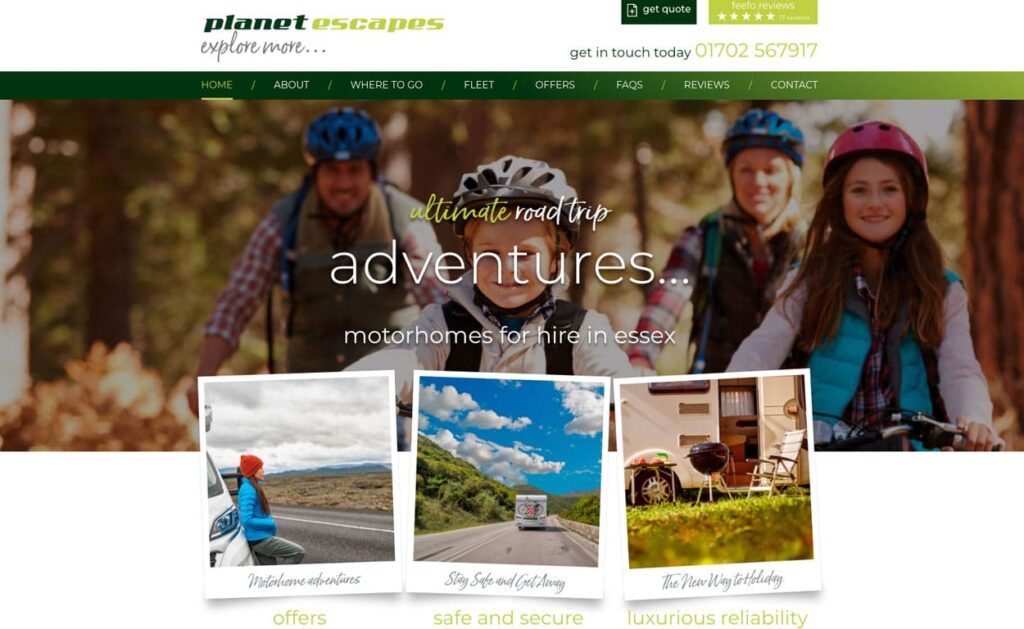
With 75% of consumers admitting to passing judgement on a company’s credibility based on their website design, the layout and structure of your website homepage could be the difference between gaining a new customer or missing out on a sale.
In this article, we take a look at the 10 elements that make up a good website homepage design.
What is a website homepage?

Your homepage is a designated entry point to your website, it introduces the user to the business and is crucial for establishing those all-important first impressions.
Did you know that first impressions are 94% design-related?
A study conducted by Sweor, cited participants comments including: boring design, bad use of colour, excessive pop up advertisements, inadequate introductory content, and too much text.
Unlike a landing page targeted toward a specific target audience, your homepage should be designed to capture the attention of a variety of target audiences from different channels.
What is a landing page?
A landing page is a standalone web page that a person “lands” on after clicking through from a digital location for example a Google Ad.
A good homepage attracts traffic, educates prospects, and incites users to get in touch.
From your homepage, a user should be able to find out who you are and what service or product you offer.
What should you include in your website homepage design?
1. Navigation
As the starting point of your user’s journey, your homepage navigation menu should be as straightforward as possible.
Users are typically looking for in-depth answers and information.
Having a well-structured navigation bar or menu ensures your visitors find the information they are looking for quickly and easily.
A poorly structured or confusing navigation system can lead some customers to give up and leave the website entirely.

2. Headline
Your homepage headlines are arguably one of the most important parts of your website. Within 3 seconds, your headline should tell users what your business is offering.
Although many visitors at different stages of the buying process might visit your homepage, your headline should target at least a 3rd of your typical audience.
3. Sub-headline
Your sub-headline should work cohesively with your headline and offer a brief description in greater detail about your service/ product.
Using the pain points of your target audience and positioning your product/ service as the solution is often an effective way to capture attention.
After reading both your headline and sub-headlines, users should know if they’re in the right place and what you can offer them.
4. Calls to action
The goal of your homepage is to guide users further into your website and move them down the sales funnel to convert them from a user to a customer.
Using several calls to action above the website fold can direct users and different stages of the buying funnel to act.
5. Visual imagery
Images and videos can trigger emotions through storytelling, they can bring products to life and connect with your target audience on a whole new level.
Make sure the images you use on your homepage indicate the product or service you offer.
6. Overview of services and features
One of the most effective ways to draw users further down the sales funnel is by overviewing your products and services.
The majority of users are looking for a solution to a problem they have.
Showcasing your products and services overview provides opportunities for further information discovery.
7. Benefits
Your customers want to know about the benefits of doing business with you.
They want to understand what makes you different and why they should choose you.
Showcasing your business’s unique selling point can make you stand out from the crowd.
8. Social Proof
92% of consumers read online reviews and testimonials when considering a purchase.
72% will take action after reading positive reviews.
31% of customers are likely to spend more on a business with excellent reviews.
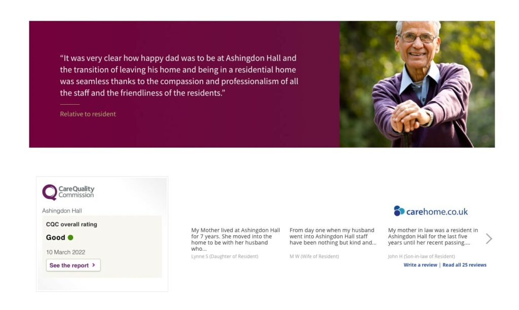
Showcasing positive reviews and testimonials helps to create a level of trust and credibility that can positively impact your conversion rate.

You could even link your testimonials to your case studies page for users looking for more insight as to why they should choose you over the competition.
Could social proof help increase your business’s credibility?
Click here to read our article on the importance of Google Reviews.
9. Resources
The majority of customers aren’t ready to buy.
For those looking for more information, showcasing blogs, case studies, and resources is a great way to keep your visitors engaged for longer whilst increasing your credibility as an industry expert.
Blogging is also a great way to increase your organic search engine ranking.
Looking to find out more about SEO?
Click here to find out more about our local search engine optimisation services.
68% of online experiences begin with a search engine (BrightEdge). By using keyword research, you can create engaging and insightful content that educates target audiences whilst benefiting SEO.
10. Contact information
Adding your contact details or a contact form on your homepage is essential to capture those customers ready to make contact.
Including your phone number in the top right-hand corner as well as in the footer allows customers at the top and bottom of your homepage to click to call instantly.
If you’d rather enquiries leave a detailed message, opt for a contact form and include relevant fields.
FAQS
- How significant is the homepage design for a website, and what impact does it have on consumer perceptions and behaviours?
The homepage design plays a pivotal role in shaping users’ perceptions of a company’s credibility. It serves as the gateway to the website, making it essential for creating positive first impressions and guiding users effectively through their journey. Elements such as navigation, layout, and visual appeal significantly influence how users perceive the professionalism and reliability of the business. - Can you explain the difference between a website homepage and a landing page, and how should each be optimised to attract and engage visitors effectively?
A website homepage is the designated entry point to a website, introducing users to the business and establishing crucial first impressions. In contrast, a landing page is a standalone web page that users “land” on after clicking through from a digital location, such as a Google Ad. While a homepage aims to capture the attention of a variety of target audiences, a landing page is tailored to specific campaigns or offers, focusing on converting visitors into leads or customers. - What are the essential elements that should be incorporated into a website homepage design to ensure it is informative, engaging, and encourages user interaction?
Essential elements for an effective website homepage design encompass various facets crucial for engaging and guiding visitors seamlessly. Clear navigation ensures users can easily find the information they seek, enhancing their browsing experience. Compelling headlines and sub-headlines succinctly communicate the business’s offerings and value proposition, capturing users’ attention from the outset. Strategic calls to action prompt users to take desired actions, guiding them through the website’s conversion funnel. Engaging visual imagery brings the brand to life and reinforces its message, fostering emotional connections with the audience. Providing an overview of services and features helps users understand the breadth of offerings and how they address their needs. Highlighting benefits and unique selling points differentiates the business and persuades users to choose its products or services. Incorporating social proof, such as positive reviews and testimonials, builds trust and credibility, instilling confidence in potential customers. Offering valuable resources like blogs and case studies not only keeps visitors engaged but also positions the business as an authority in its industry. Finally, prominently displaying contact information or a contact form makes it easy for visitors to reach out and initiate further engagement with the business. These elements collectively contribute to a compelling and effective website homepage that drives user engagement and conversion.
Web Design Agency Essex
If you need help with your website design or build, you might find it beneficial to work with a dedicated web agency. With a wealth of knowledge and experience, web design agencies like Swan Creative can bring your vision to life whilst utilising website best practices, ensuring your website is fit for purpose and delivers results.
To find out more about our website design and website development services, speak to our experts today by calling 01702 471 015.


